

Transform Your Home With These Bold Interior Design Secrets
Ever walked into a room and felt instantly at ease, without knowing why? That’s interior design at work—the deliberate play of light, texture, color, and scale that shapes how a space feels and functions. It’s not about filling a room, but about layering pieces to guide movement, spark conversation, and reflect your daily rituals. The right balance of form and function turns a house into a place you never want to leave.
What Does a Great Room Makeover Actually Cost and Where Does the Money Go?
A great room makeover typically starts around $3,500 and climbs past $15,000, depending on scope. Your budget splits into four buckets: furniture (40%), labor (25%), materials and finishes (20%), and design fees (15%). The biggest surprise is often labor—painting, electrical, and moving heavy pieces eat cash faster than the sofa does. For a mid-range living room, you’re looking at $1,400 for a quality sofa, $800 for custom drapes, and $600 for a rug that anchors the space. What’s the single largest hidden expense? It’s usually wall prep and lighting—fixing old plaster or adding dimmable fixtures can add $1,200 you didn’t plan for. The money goes where you physically feel it: seating, texture underfoot, and layered light. A $5,000 makeover works if you keep the bones and splurge on three hero pieces; a $12,000 refresh buys new floors and built-ins, but you’ll feel every dollar in the room’s daily comfort.
Breaking Down the Real Price of Furniture, Finishes, and Labor
The true expense of a makeover emerges only when you separate the price tags of furniture, finishes, and labor. Custom upholstery and solid-wood case pieces often consume 40–50% of the budget, while finishes like limewash plaster or hand-troweled microcement can cost three to four times more than standard paint per square foot. Labor, however, is where hidden costs multiply: skilled carpenters charge $80–$150 per hour, and electrical or plumbing relocation adds permits and drywall repair. Always request itemized quotes—a flat “installation fee” can mask $2,000 in unseen prep work like patching or leveling. To avoid sticker shock, allocate 60% to pieces you touch daily (sofas, hardware) and 40% to surfaces.
- Demand a line-item breakdown separating materials, delivery, and on-site labor.
- Ask if finish samples include mock-up panels—trial swatches often cost extra.
- Factor in 10–15% for waste, cutting errors, and touch-up materials.
- Negotiate hourly rates for trim work versus flat fees for standard installation.
How to Set a Realistic Budget That Covers Hidden Expenses
Start by listing every line item, not just paint and furniture, because hidden expenses in a room makeover often exceed the visible costs. Allocate 15–20% of your total as a contingency fund before purchasing anything, since delivery fees, underlayment, and wall repair surface only after work begins. Break the budget by category—labor, materials, finishing touches—and then add 10% for mid-project changes like electrical outlet relocation or trim replacement. Track actual spending weekly against your forecast, adjusting non-essential decor first if you overshoot. Finally, price out demolition and disposal upfront, as haul-away costs are frequently omitted. Q: How do you set a realistic budget that covers hidden expenses? A: Itemize every service, add a 15% buffer, and audit prices for labor and waste removal before committing, not after.
Ways to Save Big Without Sacrificing Style or Quality
You can cut a typical makeover budget by a third without touching an inch of style by rethinking where money actually goes. Prioritize high-impact splurges like a signature sofa or artisan rug, then paint walls, swap hardware, and layer vintage finds. Source factory-direct lighting and unupholstered frames in sustainable woods, then custom-order cushions separately. Shop outlet clearance for premium fabrics, and hire a designer for a two-hour consultation instead of full-service fees. The result is a curated, bespoke feel—not a cheap one.
- Repaint existing cabinetry instead of replacing it; new brushed-brass pulls transform the look for under $60.
- Buy premium floor samples or overstock tiles at 50–70% off; install them in a smart herringbone pattern for built-in luxury.
- Mix one investment statement chair with thrifted side tables—spend on what you touch daily, save on what you only look at.
How Do You Define Your Personal Style Before Buying a Single Item?
Before buying a single item, I define my personal style by first pinning down the *feeling* I want the room to radiate—cozy, airy, or dramatic—and then translating that into a concrete palette and material list. I create a digital mood board with no furniture, only textures, colors, and architectural photos, so I’m committing to a vibe, not objects. Then I write three words that describe that vibe (e.g., “warm minimal rustic”) and use them as a litmus test for every potential purchase. If a piece doesn’t clearly echo at least two of those words, it’s out. I also set physical constraints like “no visible plastic” or “only matte finishes” to keep choices honest. This way, the style exists before the shopping cart does, and each item becomes a supportive character, not a random guest. A clear definition turns decisions from guesswork into gentle curation.
Simple Exercises to Discover Whether You Love Modern, Classic, or Eclectic Looks
To pin down your taste before shopping, try a three-part **style discovery exercise** that takes ten minutes. First, pull thirty photos from Instagram or Pinterest—not rooms you’d show off, but ones you’d actually live in. Then, ask yourself what draws you: clean lines and neutral palettes scream modern, while ornate moldings and warm woods whisper classic. Finally, mix-and-match test: place a velvet tufted chair next to a sleek metal lamp. If the combo excites you, eclectic wins. For a quicker check, scan your closet—modern lovers wear solids and sharp cuts, classic fans favor blazers and pearls, and eclectic dressers clash prints on purpose. Repeat monthly; your answer shifts as you grow.
Using Mood Boards and Color Palettes to Communicate Your Taste
Before buying anything, assemble a mood board for interior design by pinning fabric swatches, architectural photos, and even art that triggers a visceral reaction. From those visuals, extract a distilled color palette—typically five to seven hues—to act as your non-negotiable filter. When you shop, compare every divine home potential piece against this palette; if a rug or lamp clashes, it fails, regardless of its appeal. This method prevents impulse purchases that deviate from your taste. A palette built from a single beloved painting often translates more cohesively than one chosen from generic trend charts. The board itself becomes a communication tool for contractors or partners, clarifying your vision without lengthy explanations.
- Limit your palette to a dominant hue, a secondary tone, and two neutrals to maintain visual balance.
- Include textures on your board, like linen or brushed brass, because they affect how colors appear in real light.
- Annotate each board item with the specific feeling it evokes, not just the style label.
How to Blend Different Design Eras Without Making the Room Feel Cluttered
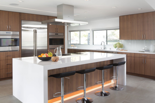
To blend design eras without clutter, anchor the room with one dominant era—typically 70% of the furniture—then introduce a second era strictly through accent pieces like lighting or textiles. Choose pieces that share a common visual weight or material, such as a mid-century walnut sideboard paired with a contemporary matte black floor lamp, so the contrast feels intentional. Limit each era to a maximum of three elements, and keep the color palette within a single tonal family to unify disparate silhouettes. Use negative space as a buffer: leave at least 18 inches between pieces from different periods. Finally, repeat one era’s defining curve or line in a smaller accessory—like a curved vase echoing an Art Deco chair—to create a subtle rhythm that prevents visual fragmentation.
What Are the Essential Steps to Plan a Room Layout Like a Pro?
Start by measuring the room precisely, noting doors, windows, and architectural fixtures, then define the zone’s primary function to anchor your layout. Sketch a scaled floor plan and place the largest piece of furniture first—usually the sofa or bed—to establish circulation pathways of at least 24 inches. Balance the arrangement by pairing focal points (like a fireplace or media wall) with secondary seating, ensuring no piece blocks natural light. Use traffic flow as your guide: imagine walking through the space, avoiding thoroughfare through conversation clusters. Finally, layer in rugs, lighting, and occasional chairs to create visual weight and intimacy. Pro tip: For a small living room, push seating against the longest wall and angle chairs toward the focal point—this opens center floor space instantly. Always test the layout by walking it before committing to holes in the wall.
Mastering Furniture Placement for Better Flow and Conversation
To master furniture placement for better flow and conversation, start by anchoring the seating arrangement around a focal point—like a fireplace, window, or media console—and angle chairs toward one another at a 30-to-45-degree turn. This subtle rotation creates a welcoming, oval-shaped conversation zone, while keeping high-traffic paths (at least 24 inches wide) along the room’s perimeter. Float furniture away from walls when space allows; this instantly boosts intimacy and lets people pass behind seated guests without disrupting dialogue. Prioritize symmetrical pairings—two sofas facing each other or a sofa with two loveseats—since balanced layouts encourage eye contact. Finally, test the setup by walking the path from door to primary seat; if you weave or squeeze, shift pieces. Strategic furniture placement transforms a room into a social magnet.
Q: What’s the fastest way to check if my furniture placement supports conversation?
A: Sit in every chair—if you must raise your voice or twist your torso to see the next person, pull that piece closer or angle it inward by 15 degrees.
How to Use Focal Points, Traffic Paths, and Negative Space Effectively
Start by anchoring the room to a single dominant focal point—a fireplace, large window, or bold art—and orient your primary seating to face it, ensuring the arrangement feels intentional rather than accidental. Then, carve clear traffic paths of at least 90 centimeters wide behind and between seating zones, never forcing movement to cut through a conversational cluster. Finally, resist the urge to fill every corner: leave negative space as a visual buffer around furniture, allowing each piece to breathe and the eye to rest. This trio—focus, flow, and emptiness—creates a layout that guides movement naturally, supports conversation, and feels spacious without wasted square meters.
Choosing the Right Scale and Proportion for Sofas, Rugs, and Tables
Choosing the right scale for a sofa begins with measuring the wall it faces, not the entire room; a proportional layout leaves at least 12–18 inches of visible floor on each side. For rugs, the front legs of all seating pieces should rest on the rug, ensuring the anchor visually connects the group; if the rug is smaller, it destabilizes the entire composition. Tables should sit 14–18 inches from the sofa edge for easy reach without crowding. A massive sectional beside a slim coffee table feels disjointed, so match visual weight between pieces. When pairing a large sofa with a low table, increase surface depth—never height—to maintain balance. Ultimately, scale consistency across furniture classes prevents a room from feeling either cavernous or cramped.
Which Materials and Finishes Offer the Best Durability for Daily Life?
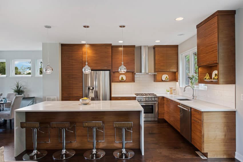
For high-traffic zones, best durability for daily life starts with natural stone and dense porcelain tile—they shrug off scratches and moisture. On floors, engineered oak with a matte polyurethane finish resists gouges better than glossy lacquers, which reveal every scuff. Quartz countertops outperform marble because they don’t etch from lemon or wine, while a low-VOC ceramic glaze on walls provides a wipeable, impact-proof membrane. Avoid soft, raw woods on cabinetry; instead, opt for thermofoil or a catalyzed conversion varnish that won’t yellow or chip. For hardware, solid brass with an unlacquered or powder-coated finish develops a rich patina rather than peeling. Finally, use water-based urethane over oil-based on trim—it flexes with humidity changes, preventing hairline cracks that ruin daily-wear surfaces.
Comparing Hardwood, Tile, Laminate, and Vinyl for Floors and Surfaces
When weighing flooring durability for daily life, hardwood offers timeless character but scratches under pets and high heels, requiring periodic refinishing. Tile excels in wet zones, resisting moisture and stains, yet its hard surface can crack heavy dropped items and feels cold underfoot. Laminate mimics wood affordably, with a tough wear layer that resists scratches, but it warps permanently if water sits on seams. Vinyl, especially rigid-core planks, provides the best overall resilience, absorbing impact, standing up to spills, and even forgiving subfloor imperfections. For high-traffic kitchens, vinyl’s waterproof core makes it a smarter choice than wood’s elegant vulnerability. Choose based on room function, not just looks.
Upholstery Fabrics That Resist Stains, Pets, and Heavy Sunlight
For daily-life durability, prioritize **performance upholstery fabrics** engineered with solution-dyed fibers, which lock color into the yarn core to withstand heavy sunlight without fading. Tightly woven polyester, nylon, or olefin blends repel liquids and resist pet claws better than natural fibers, while Crypton and Sunbrella offer built-in stain barriers and moisture resistance. Microfiber’s dense pile hides wear and cleans easily with a damp cloth, making it ideal for high-traffic zones. Even stain-resistant fabrics require prompt blotting, as acids in pet urine or sunscreen can etch finishes over time. Choose a high rub-count (over 30,000 Martindale) for abrasion resistance, and opt for dark, patterned textiles to camouflage fur and soiling.
Q: What is the most pet- and sun-proof upholstery fabric? A: A solution-dyed acrylic like Sunbrella, which resists fading, moisture, and claw snags, outperforming standard polyester in harsh, direct-light rooms.
Selecting Paint Finishes and Hardware that Look Great and Wear Well
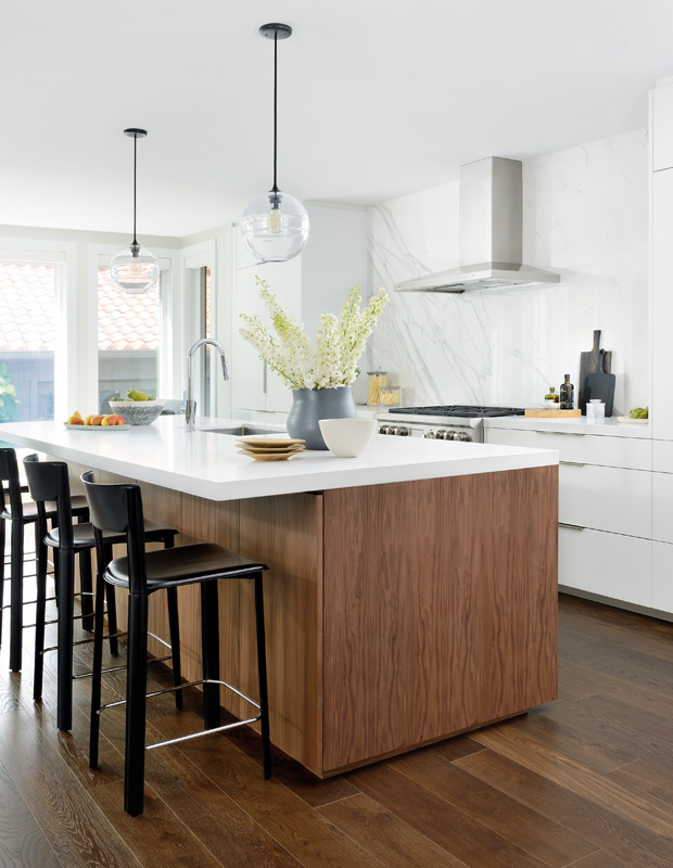
For daily-life durability, choose paint finishes by room traffic: **eggshell or satin for walls** resists scrubbing without glare, while semi-gloss on trim and doors handles fingerprints and scuffs effortlessly. Skip flat sheens in hallways—they mar and can’t be cleaned. For hardware, prioritize solid brass, stainless steel, or powder-coated zinc over plated options; brushed or matte textures hide smudges better than polished chrome, which shows every touch. Test lever-style handles with a firm grip. Verify that hinges and knobs share a finish tone—mismatched undertones cheapen the look. Opt for lacquered or sealed finishes on frequently used pieces to prevent wear.
Durable beauty comes from pairing washable paint sheens with solid, low-maintenance hardware that resists daily friction and fingerprints.
How Can You Use Light, Color, and Texture to Transform a Small or Dark Space?
In a dim, narrow hallway, you can feel the shift the moment you swap a harsh overhead bulb for layered, warm lamps at waist height—light that pools rather than floods. Paint the walls a soft, greige with a matte finish, and let a single accent wall in deep terracotta catch the morning sun, tricking the eye into believing the room extends further. Run your hand along a chunky linen throw or a ribbed ceramic vase; texture becomes the quiet trickster, drawing focus away from square footage and toward sensation. A glossy ceiling reflects whatever scarce daylight exists, while rough, natural wood on the floor grounds the space, making it feel intentional rather than cramped. Mirrors angled opposite windows double every beam, and glossy tiles or metal trims bounce color back into shadowed corners, so even a closet-sized room breathes with layered depth.
Layering Ambient, Task, and Accent Lighting to Change the Mood Instantly
Transform a cramped room by installing three distinct lighting layers that you control independently. Ambient light, like a dimmer-controlled ceiling fixture, establishes a base glow, while a focused task lamp over a reading chair or desk carves out a functional zone. Suddenly, accent lighting—a warm LED strip behind a shelf or a picture light on art—adds drama and depth. Switching between these layers, from bright daytime productivity to a single warm accent for evening cocktails, instantly alters spatial perception. **Layering ambient, task, and accent lighting** is your fastest mood-shifting tool.
Q: How does layering lighting change a room’s mood instantly?
A: By toggling between layers—dimming the ambient and boosting an accent—you shift from a flat, utilitarian feel to a dramatic, intimate scene in seconds, without altering any furniture.
Color Strategies that Visually Expand Narrow Rooms or Lower Ceilings
To make a narrow room feel wider, paint the end walls a slightly deeper tone than the long walls, tricking the eye into perceiving depth where the corridor tightens. For lower ceilings, use a pale, almost white ceiling color with a subtle cool undertone to reflect light and push the plane upward. Instead of harsh contrast, keep wall and trim colors in the same family to blur boundaries and eliminate visual stops. A vertical accent stripe on one narrow wall can also suggest height, while a horizontal band near the floor draws the eye sideways, expanding perceived width without structural changes. Always test colors at different times of day.
Texture Pairings—from Velvet to Rattan—That Add Depth and Warmth
Pairing plush velvet with woven rattan creates a tactile dialogue that instantly warms a compact room. Velvet’s dense, light-absorbing pile contrasts with rattan’s open, reflective weave, preventing visual monotony while softening hard edges. For depth, place a velvet ottoman near a rattan armchair, or mount a rattan pendant above a velvet bench. The key is balancing scale—oversized velvet cushions against slim rattan frames—to avoid clutter. This juxtaposition also tricks the eye into reading more surface variation, making walls feel less confining.
- Use velvet on seating or throws, rattan for lamp bases or side tables
- Limit to two texture families per zone to maintain cohesion
- Add a flat-weave wool rug to bridge the soft and rigid textures
Such pairings amplify usable warmth by introducing layered sensory contrast without adding bulky furniture. The matte finish of rattan catches indirect light, while velvet absorbs it, creating shadowed pockets that give the room a lived-in, inviting character.

Recent Comments